How it got made.
- 00:00:01:00
Concept & Brief
The goal was to onboard new users to UniHub within the first minute of watching, so before opening any software I broke down the core user journey: discovering events, joining campus communities, and getting tickets. I used that as the narrative backbone, making sure every scene mapped directly to a feature a new user actually needs to understand.
- 00:00:02:00
Storyboarding
I storyboarded the video in After Effects, blocking out each beat frame by frame to lock in pacing before committing to full animation. This helped me figure out where kinetic typography should carry the story versus where illustration needed to take over, and kept the one minute plus runtime tight without feeling rushed.
- 00:00:03:00
Illustration & Vector Assets
With the storyboard locked, I moved into Illustrator to build out the custom vector illustrations and iconography. I designed everything to sit cleanly within UniHub's brand palette, keeping shapes simple and modular so they would animate smoothly without losing clarity at different sizes.
- 00:00:04:00
Motion & Typography
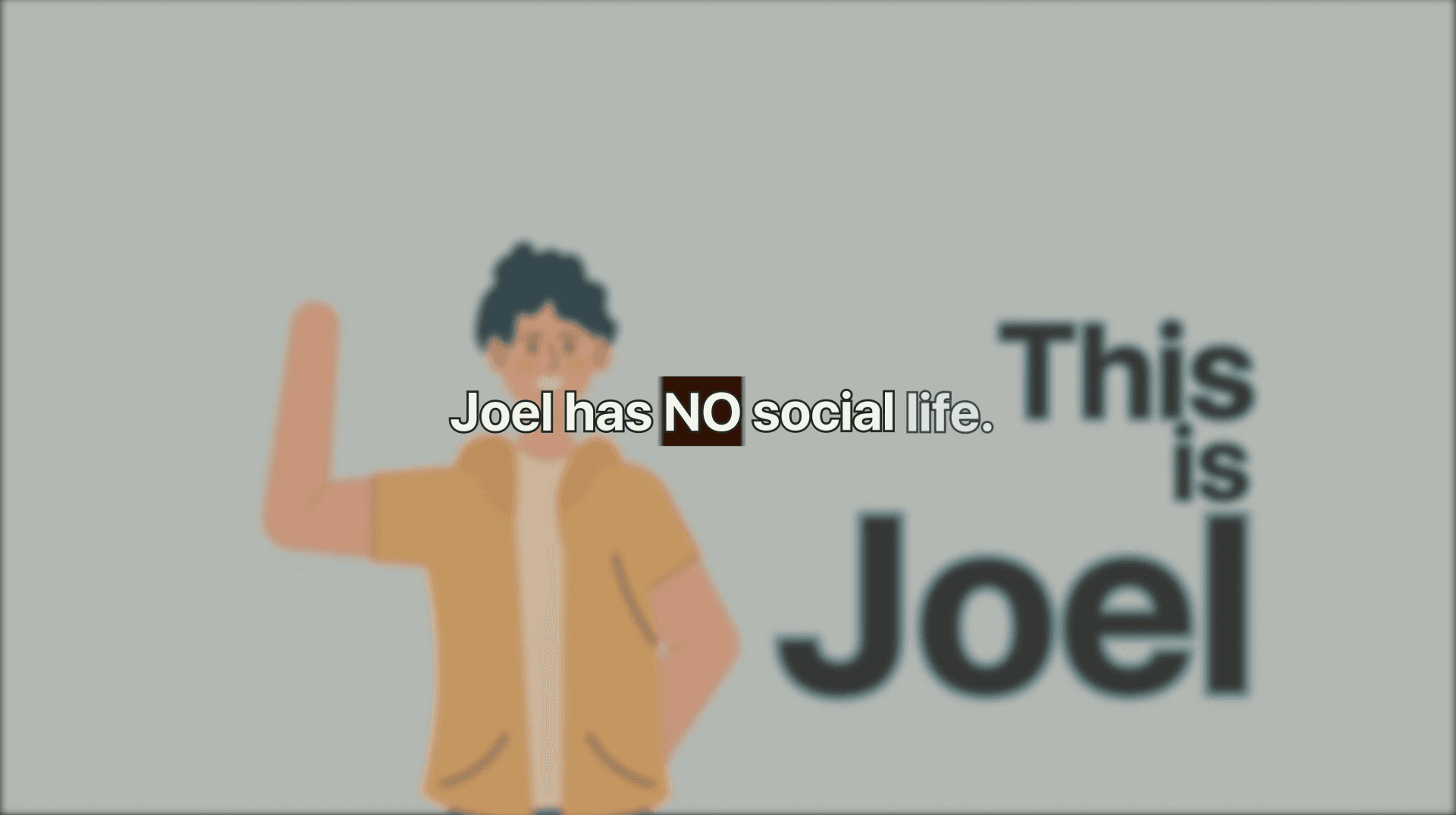
Back in After Effects, I animated each illustration and built out the kinetic typography that drives the pacing throughout the video. I focused on rhythm here, timing text reveals and transitions so the piece feels energetic rather than cluttered, and used easing and overlap to keep every cut feeling intentional.
- 00:00:05:00
Brand Consistency
Throughout the animation phase, I kept checking pacing and color against UniHub's brand guidelines, making sure the video felt like a natural extension of the product rather than a separate marketing asset.
- 00:00:06:00
Final Polish & Export
I did a final pass for timing, color consistency, and overall flow, tightening any beats that dragged and making sure the video read clearly even without sound for platforms where autoplay mutes video by default.